Flutter ListView and GridView: Complete Beginner Guide
Build scrolling lists and grids in Flutter: ListView, ListView.builder, ListView.separated, horizontal lists, GridView.builder, childAspectRatio, and a complete responsive product grid.
By Yaqoob Developer · · 7 min read
- #Flutter
- #ListView
- #GridView
- #Flutter UI
- #Beginners
Lists and grids are everywhere: chat lists, contacts, product catalogs, photo galleries, settings pages. In Flutter you build them with ListView and GridView.
This beginner guide shows every common type of list and grid with complete code and screenshots, and explains which one to use when.
In this post you will learn:
ListViewfor short, fixed listsListView.builderfor long and dynamic listsListView.separatedfor lists with dividers- Horizontal lists
GridView.countandGridView.builder- How to control the size of grid items with
childAspectRatio - A complete product grid example
- How to fix the most common list errors
Why not just use a Column?
A Column shows all its children at once and cannot scroll. If the items do not fit on the screen, you get an overflow error.
ListView and GridView scroll, and their .builder versions only build the items that are visible on screen. A list of 10,000 items is just as fast as a list of 10.
ListView: for short, fixed lists
The simplest version takes a list of widgets in children:
ListView(
  children: const [
    ListTile(leading: Icon(Icons.person), title: Text('Profile')),
    ListTile(leading: Icon(Icons.notifications), title: Text('Notifications')),
    ListTile(leading: Icon(Icons.lock), title: Text('Privacy')),
    ListTile(leading: Icon(Icons.help), title: Text('Help')),
  ],
)
This is perfect for a settings page or a menu, where you know every item in advance.
ListTile is a ready-made row with slots for leading (left), title, subtitle and trailing (right). Use it whenever you can; it handles padding, alignment and tap effects for you.
ListView.builder: for long or dynamic lists
When your items come from data (an API, a database, a list in memory), use ListView.builder:
class Contact {
  const Contact(this.name, this.phone);

  final String name;
  final String phone;
}

const contacts = [
  Contact('Ali Khan', '+92 300 1234567'),
  Contact('Sara Ahmed', '+92 301 2345678'),
  Contact('Usman Tariq', '+92 302 3456789'),
  Contact('Ayesha Malik', '+92 303 4567890'),
  Contact('Bilal Hussain', '+92 304 5678901'),
  Contact('Fatima Noor', '+92 305 6789012'),
  Contact('Hamza Iqbal', '+92 306 7890123'),
];

class ContactsScreen extends StatelessWidget {
  const ContactsScreen({super.key});

  @override
  Widget build(BuildContext context) {
    return Scaffold(
      appBar: AppBar(title: const Text('Contacts')),
      body: ListView.builder(
        itemCount: contacts.length,
        itemBuilder: (context, index) {
          final contact = contacts[index];
          return ListTile(
            leading: CircleAvatar(child: Text(contact.name[0])),
            title: Text(contact.name),
            subtitle: Text(contact.phone),
            trailing: IconButton(
              icon: const Icon(Icons.call),
              onPressed: () {},
            ),
          );
        },
      ),
    );
  }
}
itemCounttells Flutter how many items there are.itemBuilderis called for each visible item with itsindex, and returns the widget for that row.
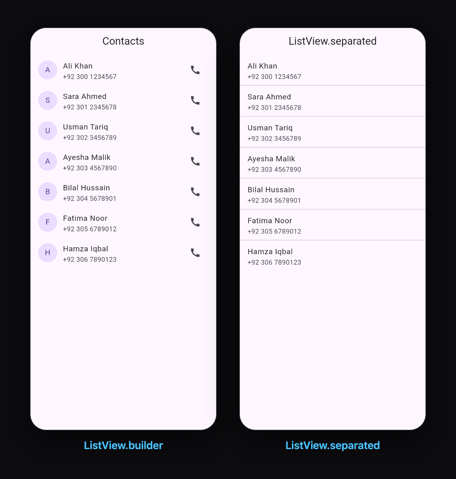
Always set itemCount. Without it, Flutter keeps asking for more items forever and your code fails with a RangeError when index goes past the end of the list.
ListView.separated: lists with dividers
Need a line between items? Use ListView.separated. It works like .builder but adds a separatorBuilder:
ListView.separated(
  itemCount: contacts.length,
  separatorBuilder: (context, index) => const Divider(height: 1),
  itemBuilder: (context, index) {
    final contact = contacts[index];
    return ListTile(
      title: Text(contact.name),
      subtitle: Text(contact.phone),
    );
  },
)
The separator appears between items only, never after the last one.
Horizontal lists
Set scrollDirection: Axis.horizontal to scroll sideways. A horizontal list needs a fixed height, so wrap it in a SizedBox:
SizedBox(
  height: 110,
  child: ListView.separated(
    scrollDirection: Axis.horizontal,
    padding: const EdgeInsets.symmetric(horizontal: 16),
    itemCount: categories.length,
    separatorBuilder: (context, index) => const SizedBox(width: 12),
    itemBuilder: (context, index) {
      final category = categories[index];
      return Column(
        children: [
          CircleAvatar(radius: 32, child: Icon(category.icon, size: 28)),
          const SizedBox(height: 8),
          Text(category.name),
        ],
      );
    },
  ),
)
This is how you build "categories" or "stories" rows at the top of shopping and social apps.
GridView.count: simple grids
GridView.count creates a grid with a fixed number of columns:
GridView.count(
  crossAxisCount: 3,          // 3 columns
  mainAxisSpacing: 12,        // vertical gap
  crossAxisSpacing: 12,       // horizontal gap
  padding: const EdgeInsets.all(12),
  children: List.generate(12, (index) {
    return Container(
      color: Colors.teal.shade200,
      alignment: Alignment.center,
      child: Text('${index + 1}'),
    );
  }),
)
Like the basic ListView, it builds every child at once, so use it only for small grids.
GridView.builder: grids from data
For real data, use GridView.builder with a grid delegate that describes the layout:
GridView.builder(
  padding: const EdgeInsets.all(12),
  itemCount: photos.length,
  gridDelegate: const SliverGridDelegateWithFixedCrossAxisCount(
    crossAxisCount: 2,
    mainAxisSpacing: 12,
    crossAxisSpacing: 12,
  ),
  itemBuilder: (context, index) {
    return Image.network(photos[index], fit: BoxFit.cover);
  },
)
There are two delegates to choose from:
| Delegate | Columns | Best for |
|---|---|---|
SliverGridDelegateWithFixedCrossAxisCount | a fixed number, e.g. always 2 | phones |
SliverGridDelegateWithMaxCrossAxisExtent | as many as fit, each at most N pixels wide | tablets and web, responsive layouts |
With SliverGridDelegateWithMaxCrossAxisExtent(maxCrossAxisExtent: 200), a phone shows 2 columns and a tablet automatically shows 4 or 5.
childAspectRatio: control the item size
Grid items are square by default. Product cards usually need to be taller. Use childAspectRatio, which is width ÷ height:
| childAspectRatio | Shape |
|---|---|
1 | square (default) |
0.75 | taller than wide, good for product cards |
1.5 | wider than tall, good for banners |
If your card content overflows at the bottom, lower the childAspectRatio to make the items taller.
Complete example: a product grid
Here is a real shopping-app grid that puts it all together:
import 'package:flutter/material.dart';

class Product {
  const Product(this.name, this.price, this.color, this.icon);

  final String name;
  final double price;
  final Color color;
  final IconData icon;
}

const products = [
  Product('Sneakers', 89.99, Color(0xFFFFE0B2), Icons.directions_run),
  Product('Headphones', 59.00, Color(0xFFB3E5FC), Icons.headphones),
  Product('Backpack', 45.50, Color(0xFFC8E6C9), Icons.backpack),
  Product('Watch', 129.00, Color(0xFFE1BEE7), Icons.watch),
  Product('Camera', 349.00, Color(0xFFFFCDD2), Icons.photo_camera),
  Product('Sunglasses', 25.00, Color(0xFFFFF9C4), Icons.wb_sunny),
];

class ProductGridScreen extends StatelessWidget {
  const ProductGridScreen({super.key});

  @override
  Widget build(BuildContext context) {
    return Scaffold(
      appBar: AppBar(title: const Text('Shop')),
      body: GridView.builder(
        padding: const EdgeInsets.all(16),
        itemCount: products.length,
        gridDelegate: const SliverGridDelegateWithMaxCrossAxisExtent(
          maxCrossAxisExtent: 220,
          mainAxisSpacing: 16,
          crossAxisSpacing: 16,
          childAspectRatio: 0.75,
        ),
        itemBuilder: (context, index) => ProductCard(product: products[index]),
      ),
    );
  }
}

class ProductCard extends StatelessWidget {
  const ProductCard({super.key, required this.product});

  final Product product;

  @override
  Widget build(BuildContext context) {
    return Card(
      clipBehavior: Clip.antiAlias,
      child: InkWell(
        onTap: () {},
        child: Column(
          crossAxisAlignment: CrossAxisAlignment.start,
          children: [
            Expanded(
              child: Container(
                width: double.infinity,
                color: product.color,
                child: Icon(product.icon, size: 56, color: Colors.black54),
              ),
            ),
            Padding(
              padding: const EdgeInsets.all(12),
              child: Column(
                crossAxisAlignment: CrossAxisAlignment.start,
                children: [
                  Text(
                    product.name,
                    maxLines: 1,
                    overflow: TextOverflow.ellipsis,
                    style: const TextStyle(fontWeight: FontWeight.w600),
                  ),
                  const SizedBox(height: 4),
                  Row(
                    children: [
                      Text(
                        '\$${product.price.toStringAsFixed(2)}',
                        style: TextStyle(
                          color: Theme.of(context).colorScheme.primary,
                          fontWeight: FontWeight.bold,
                        ),
                      ),
                      const Spacer(),
                      const Icon(Icons.add_shopping_cart, size: 20),
                    ],
                  ),
                ],
              ),
            ),
          ],
        ),
      ),
    );
  }
}
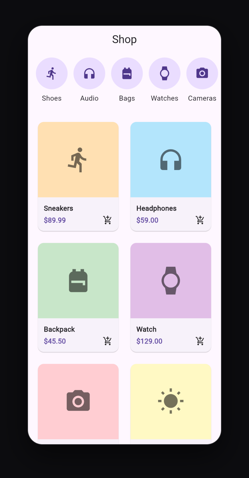
What makes this grid work well:
SliverGridDelegateWithMaxCrossAxisExtentmakes it responsive: 2 columns on a phone, more on a tablet or the web.childAspectRatio: 0.75makes each card taller than it is wide.Expandedaround the colored image area lets it take all the space left above the text.InkWellinside theCardgives a ripple effect when tapped, andclipBehavior: Clip.antiAliaskeeps the ripple inside the rounded corners.maxLines: 1withellipsisstops long product names from breaking the layout.
Useful extras
Pull to refresh
Wrap any list in RefreshIndicator:
RefreshIndicator(
  onRefresh: () async {
    // load fresh data here
  },
  child: ListView.builder(...),
)
Swipe to delete
Wrap each item in Dismissible:
Dismissible(
  key: ValueKey(contact.name),
  onDismissed: (direction) {
    setState(() => contactList.remove(contact));
  },
  background: Container(color: Colors.red),
  child: ListTile(title: Text(contact.name)),
)
The key must be unique for each item.
Empty state
Always show a message when there is nothing to display, instead of a blank screen:
items.isEmpty
    ? const Center(child: Text('No items yet'))
    : ListView.builder(...)
Common errors and how to fix them
"Vertical viewport was given unbounded height"
You put a ListView or GridView directly inside a Column. The list wants infinite height, and the Column gives it unlimited space, so Flutter cannot decide its size. Fix it by wrapping the list in Expanded:
Column(
  children: [
    const Text('Header'),
    Expanded(child: ListView.builder(...)),
  ],
)
"Horizontal viewport was given unbounded height"
A horizontal ListView inside a Column needs a fixed height. Wrap it in SizedBox(height: ...).
Using shrinkWrap: true everywhere
shrinkWrap: true also fixes the errors above, but it forces Flutter to build every item at once, which removes the speed benefit of .builder. Use it only for short lists inside another scrolling view. Prefer Expanded or a fixed height.
"RangeError (index): Invalid value"
You forgot itemCount, or it does not match the length of your data. Always use itemCount: yourList.length.
"Bottom overflowed by X pixels" inside grid cards
The card content is taller than the grid cell. Lower childAspectRatio (for example from 0.8 to 0.7) or make the content smaller.
Quick reference
| Need | Use |
|---|---|
| A few fixed items (settings) | ListView(children: [...]) |
| Many items from data | ListView.builder |
| Dividers between items | ListView.separated |
| Sideways list | scrollDirection: Axis.horizontal + fixed height |
| Small fixed grid | GridView.count |
| Grid from data | GridView.builder |
| Responsive grid | SliverGridDelegateWithMaxCrossAxisExtent |
| Taller grid items | childAspectRatio below 1 |
What to learn next
- How to Fetch API Data in Flutter Using HTTP to fill your lists with real data from the internet
- Flutter Navigation: How to Move Between Screens to open a details page when an item is tapped
- How to Add Images, Icons and Custom Fonts in Flutter to make your cards look real
Keep reading
More articles
· 9 min read
Dart Basics for Flutter Beginners: Variables, Functions and Classes
Learn the Dart you need for Flutter: variables, final and const, null safety, lists and maps, if and loops, functions with named parameters, classes, and async/await, with runnable examples.
· 9 min read
Flutter Row, Column and Stack Explained with Examples
Understand Flutter's core layout widgets: main and cross axis, mainAxisAlignment, crossAxisAlignment, Expanded, Flexible, Spacer, Stack and Positioned, plus a complete profile card example.
· 7 min read
Flutter Navigation: How to Move Between Screens
Learn Flutter navigation step by step: Navigator.push and pop, passing data to a screen, returning results, pushReplacement for login flows, named routes, and when to use go_router.