Dark Luxury Login Screen UI in Flutter
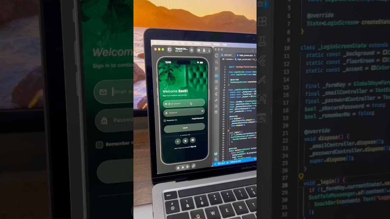
A dark, elegant login screen built in Flutter, with a full-screen green-tinted background image, glassy input fields, password toggle and social login buttons.
- #Login
- #Authentication
- #Dark UI
- #Background Image
- #Gradient Overlay
- #Social Login
- #Luxury UI
Overview
This project is a dark, elegant login screen built in Flutter, designed for apps that want a premium and moody first impression. Instead of a flat color header, the screen uses a full-screen background photo with a deep green tint that fades smoothly into black. The result feels luxurious and calm, making it a great fit for furniture stores, interior design apps, boutique hotels, lifestyle brands and any product that wants to feel high-end. The background image shows a tufted leather chair next to large indoor plant leaves, all tinted in rich emerald tones. A gradient overlay runs from the top of the screen to the bottom, starting with the visible image and ending in near-black. This keeps the photo visible at the top while making sure the form area stays dark and easy to read. It's a useful technique to learn, because it lets you place text and inputs over any image without losing contrast. Over the image sits the welcome heading, "Welcome Back!", which mixes two text styles. The word "Welcome" uses a light, thin italic in a soft grey, while "Back!" uses a bold white weight. This contrast gives the heading personality and adds an editorial, magazine-style touch. Below it, a short subtitle reads "Sign in to continue your journey" in a muted tone, guiding users without competing with the heading. The form section includes two pill-shaped input fields with a semi-transparent dark fill and a thin subtle border, giving them a soft glass-like look against the background. The email field has a mail icon on the left, and the password field has a lock icon on the left and an eye button on the right to show or hide the password. When a field is focused, its border becomes more visible, so users always know where they're typing. Both fields use white text with comfortable spacing, keeping them readable on the dark background. Below the inputs is a row with a "Remember me" checkbox on the left and a bold white "Forgot Password?" link on the right. The checkbox uses a dark rounded style that blends into the theme instead of standing out with a bright color. The main Log In button is a full-width dark pill with a thin border and centered white text. Rather than using a bright accent color, it keeps the same understated tone as the rest of the screen, which supports the calm, luxury feel. This is a good example of how to design a primary button that still stands out through size and placement rather than loud color. Below the button, an "or continue with" divider separates the form from the social login options. Three circular buttons let users sign in with Google, Apple or Facebook. All three use monochrome white icons on dark circles, so they match the theme instead of adding colorful brand logos that might clash with the design. At the bottom, a "Don't have an account? Sign Up" link gives new users a clear path to create an account. The color palette is built around deep green, charcoal and black, with white used for text and icons. Because the look depends mostly on the background image and its tint, rebranding is simple. You can replace the photo with your own product or brand image, change the green tint to any color, and the rest of the screen will still feel consistent. This UI works well for furniture and home decor apps, interior design platforms, hotel and travel apps, fashion and lifestyle brands, and premium membership apps. It's also a solid reference for anyone who wants to learn how to layer gradients over images, build translucent input fields, and design dark mode screens that still feel warm and inviting. The project is built entirely with Flutter widgets and is easy to customize. You can connect the form to Firebase Authentication, Supabase or your own REST API, and link the social buttons to the Google Sign-In, Sign in with Apple and Facebook Login packages. If you're learning Flutter, this project is a practical way to understand stacks, gradient overlays, custom text fields and clean dark UI structure.
Watch the build
Keep exploring
Related projects
 Auth / Login UI
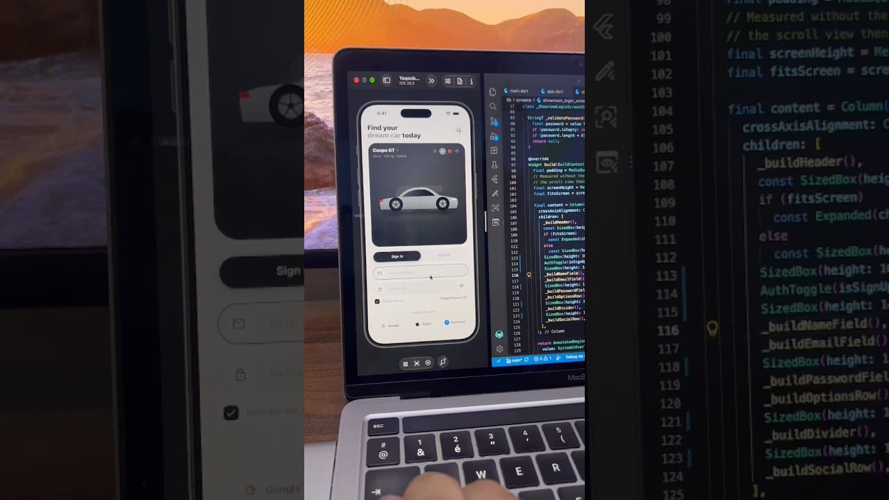
Car App Sign In Screen with Color Picker in Flutter
A light car app sign-in screen built in Flutter, with a car showcase card, color selector, Sign In/Sign Up toggle, password toggle and social login buttons.
- #Login
- #Sign In
- #Authentication
 Auth / Login UI
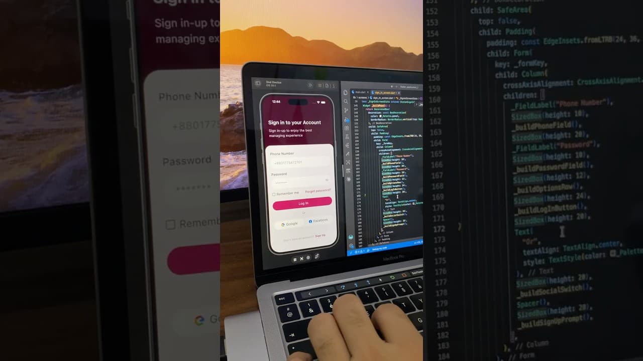
Phone Number Login Screen UI in Flutter
A minimal login screen built in Flutter with a deep maroon header, phone number and password fields, password toggle, and Google and Facebook login buttons.
- #Login
- #Authentication
- #Phone Login
 Auth / Login UI
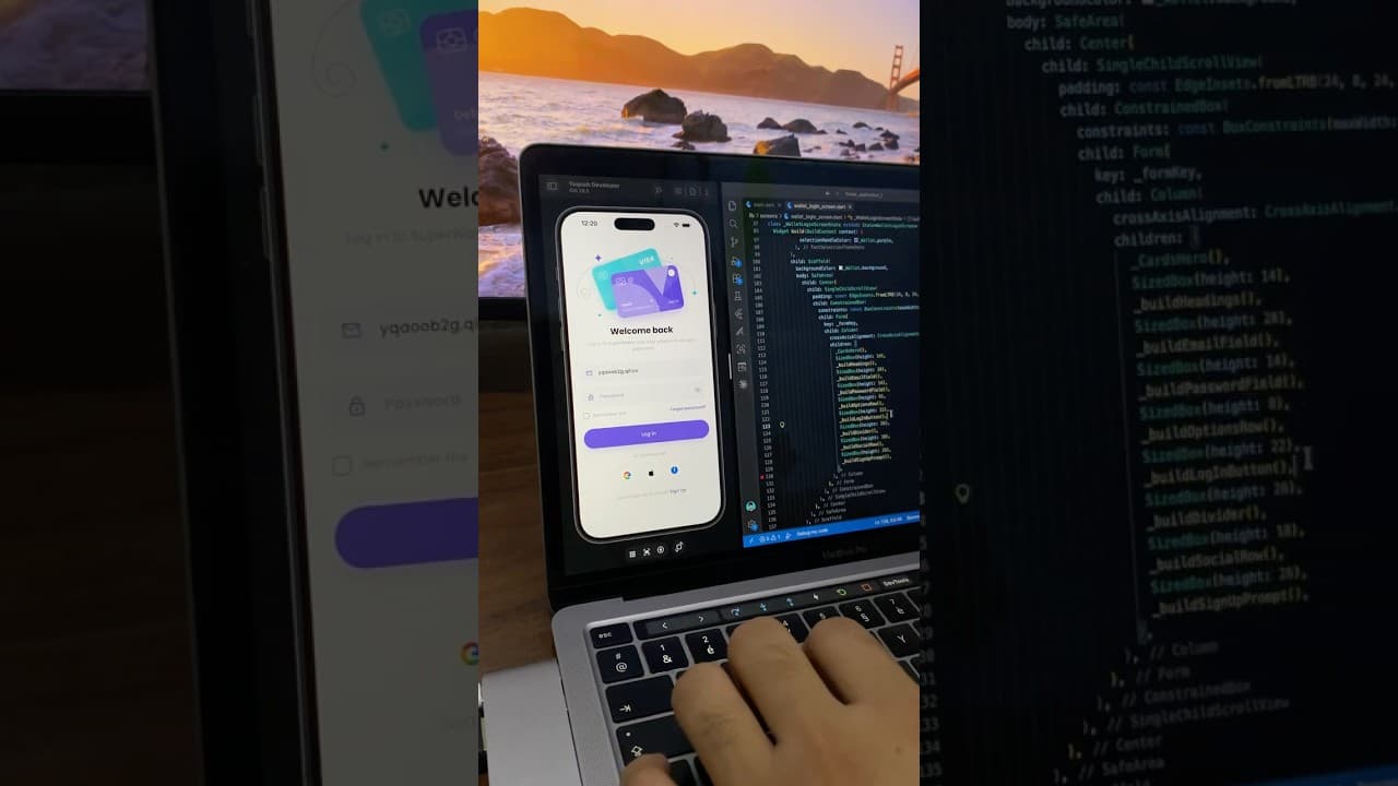
Wallet App Login Screen UI in Flutter
A colorful login screen for a digital wallet app built in Flutter, with a purple curved header, payment card illustration, password toggle and social login buttons.
- #Login
- #Authentication
- #Social Login