Car App Sign In Screen with Color Picker in Flutter
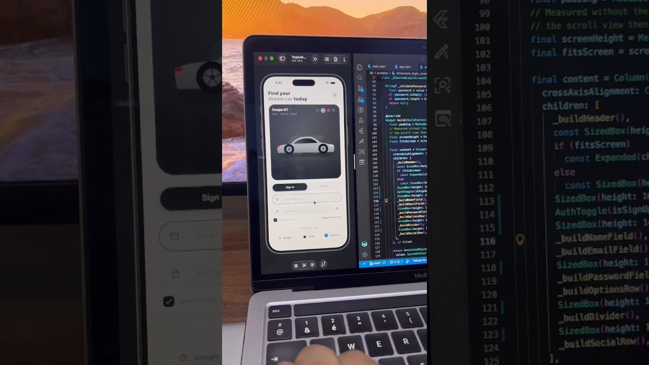
A light car app sign-in screen built in Flutter, with a car showcase card, color selector, Sign In/Sign Up toggle, password toggle and social login buttons.
- #Login
- #Sign In
- #Authentication
- #Social Login
- #Car App
- #Color Picker
- #Tab Toggle
- #Forms
Overview
This project is a clean, modern sign-in screen designed for car dealership, car marketplace and car rental apps. It combines a product showcase with a login form, so users see something exciting the moment they open the app instead of a plain form. The whole screen is built with Flutter widgets, making it a good reference for anyone who wants to learn how to build polished, real-world authentication screens. The screen opens with a bold two-line heading, "Find your dream car today", where the words "dream car" are styled in a lighter grey to create contrast and draw the eye. On the right side of the heading sits a round support button with a headset icon, giving users a quick way to reach customer help before they even sign in. This small detail is common in automotive and fintech apps, where users often need assistance during onboarding. Below the heading is the main highlight of the screen: a large dark showcase card with rounded corners and a soft gradient background. The card displays the car's name, "Coupe GT", along with a small green status dot and a short specs line showing the color, horsepower and engine type. In the center, a side-view car illustration sits on a subtle reflection, giving the card a premium, studio-like feel. In the top-right corner of the card is a row of color swatches in black, silver, red and blue. The selected color is marked with a white ring, letting users preview different paint options. This turns a simple login screen into an interactive brand moment and is a great example of how to make auth screens feel less boring. Under the showcase card is a segmented toggle that switches between Sign In and Sign Up. The active tab is filled with a dark background and white text, while the inactive tab stays light grey. This pattern keeps both flows on one screen, so users don't have to navigate to a separate page to create an account. The form section includes two pill-shaped input fields. The email field has a mail icon inside a white circle on the left, and when focused it shows a dark outline so users clearly know which field is active. The password field uses a lock icon on the left and an eye button on the right to show or hide the password. Both fields share the same rounded style, keeping the design consistent and easy to scan. Below the fields is a row with a "Remember me" checkbox on the left and a "Forgot Password?" link on the right. The checkbox uses a dark filled style with a white checkmark to match the rest of the theme. Next comes the main Sign In button, a full-width dark pill with centered text and a white circular arrow button on the right side, adding a sense of direction and action. At the bottom, an "or continue with" divider separates the form from the social login options. Three outlined pill buttons let users sign in with Google, Apple or Facebook, each showing its brand icon next to its name. The buttons are laid out evenly in one row, which works well on most phone sizes. The color palette is mostly white, light grey and near-black, with small pops of color coming from the car swatches, the status dot and the social icons. This neutral base makes the screen easy to rebrand. You can change the dark color to your brand color, replace the car illustration with your own product image, or update the specs text to match any vehicle. This UI is a great starting point for several types of apps, including car dealership apps, used car marketplaces, car rental and booking apps, and test drive scheduling apps. It also works for any product-focused app where you want to show off an item on the login screen, such as bikes, watches or sneakers. The source code is organized to be easy to read and modify. You can connect the form to Firebase Authentication, Supabase, or your own REST API, and plug the social buttons into the Google Sign-In, Sign in with Apple and Facebook Login packages. If you're learning Flutter, this project is a practical way to understand layout, custom input fields, segmented toggles, rounded cards and clean UI structure.
Watch the build
Keep exploring
Related projects
 Auth / Login UI
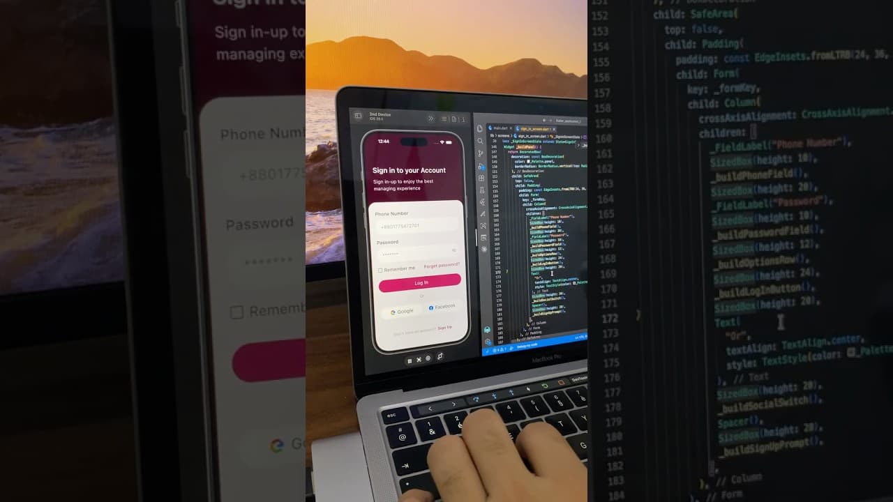
Phone Number Login Screen UI in Flutter
A minimal login screen built in Flutter with a deep maroon header, phone number and password fields, password toggle, and Google and Facebook login buttons.
- #Login
- #Authentication
- #Phone Login
 Auth / Login UI
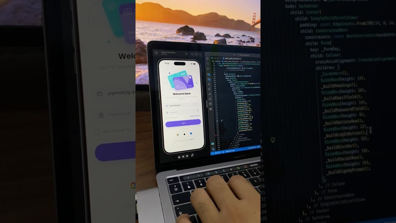
Wallet App Login Screen UI in Flutter
A colorful login screen for a digital wallet app built in Flutter, with a purple curved header, payment card illustration, password toggle and social login buttons.
- #Login
- #Authentication
- #Social Login
 Auth / Login UI
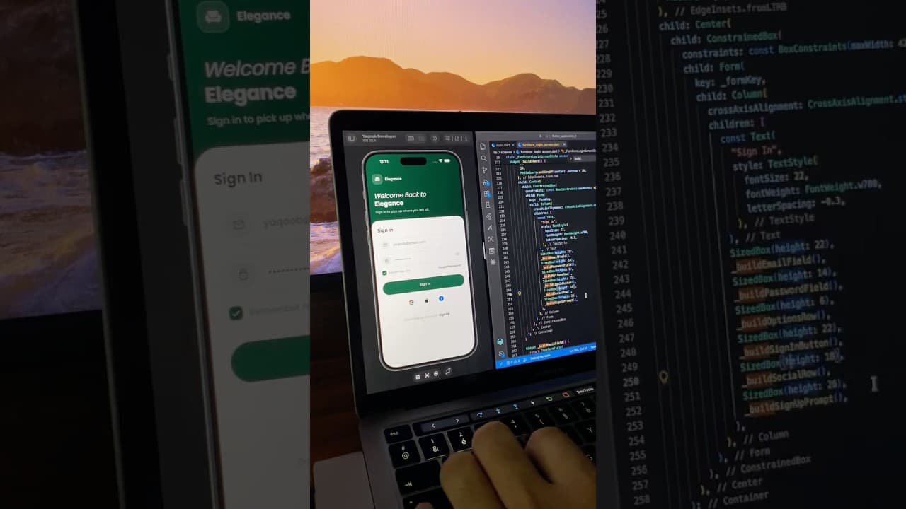
Furniture App Sign In Screen UI in Flutter
An elegant sign-in screen for a furniture shopping app built in Flutter, with a deep green header, outlined input fields, password toggle and social login buttons.
- #Login
- #Sign In
- #Authentication