Flutter Row, Column and Stack Explained with Examples
Understand Flutter's core layout widgets: main and cross axis, mainAxisAlignment, crossAxisAlignment, Expanded, Flexible, Spacer, Stack and Positioned, plus a complete profile card example.
By Yaqoob Developer · · 9 min read
- #Flutter
- #Layout
- #Row
- #Column
- #Stack
- #Beginners
Almost every Flutter screen is built from three layout widgets: Row, Column and Stack. Once you understand them, you can build nearly any design you see on Dribbble or in real apps.
This guide explains each one with simple examples and screenshots, then combines all three into a real profile card.
In this post you will learn:
- The difference between Row, Column and Stack
- What the main axis and cross axis are
- How
mainAxisAlignmentandcrossAxisAlignmentwork - How to share space with
Expanded,FlexibleandSpacer - How to add spacing between children
- How to place widgets on top of each other with
StackandPositioned - How to fix the "RenderFlex overflowed" error
Row, Column and Stack in one sentence each
- Column places its children top to bottom.
- Row places its children left to right.
- Stack places its children on top of each other, like layers.
All three take a list of widgets in their children property:
Column(
  children: [
    Text('First'),
    Text('Second'),
    Text('Third'),
  ],
)
To follow along, put each example inside the body of a Scaffold:
Scaffold(
  body: SafeArea(
    child: /* your Row, Column or Stack here */,
  ),
)
We will use a small helper to draw colored boxes, so the layouts are easy to see:
Widget box(Color color, {double size = 70, String label = ''}) {
  return Container(
    width: size,
    height: size,
    color: color,
    alignment: Alignment.center,
    child: Text(label, style: const TextStyle(color: Colors.white, fontSize: 18)),
  );
}
Main axis and cross axis
This is the most important idea in this post:
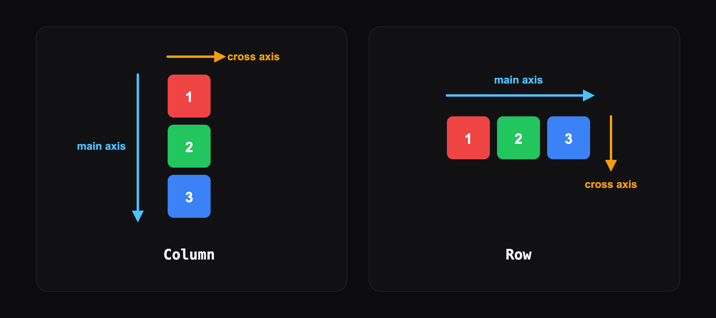
- The main axis is the direction the widget places children in.
- The cross axis is the other direction.
| Widget | Main axis | Cross axis |
|---|---|---|
| Column | vertical ↓ | horizontal → |
| Row | horizontal → | vertical ↓ |
Every alignment property is named after one of these axes, so once you know which is which, the properties make sense.
Column
Column(
  mainAxisAlignment: MainAxisAlignment.center,
  crossAxisAlignment: CrossAxisAlignment.center,
  children: [
    box(Colors.red, label: '1'),
    box(Colors.green, label: '2'),
    box(Colors.blue, label: '3'),
  ],
)
mainAxisAlignmentcontrols the vertical position of the children (because a Column's main axis is vertical).crossAxisAlignmentcontrols the horizontal position.
Row and mainAxisAlignment
Row(
  mainAxisAlignment: MainAxisAlignment.spaceBetween,
  children: [
    box(Colors.red, label: '1'),
    box(Colors.green, label: '2'),
    box(Colors.blue, label: '3'),
  ],
)
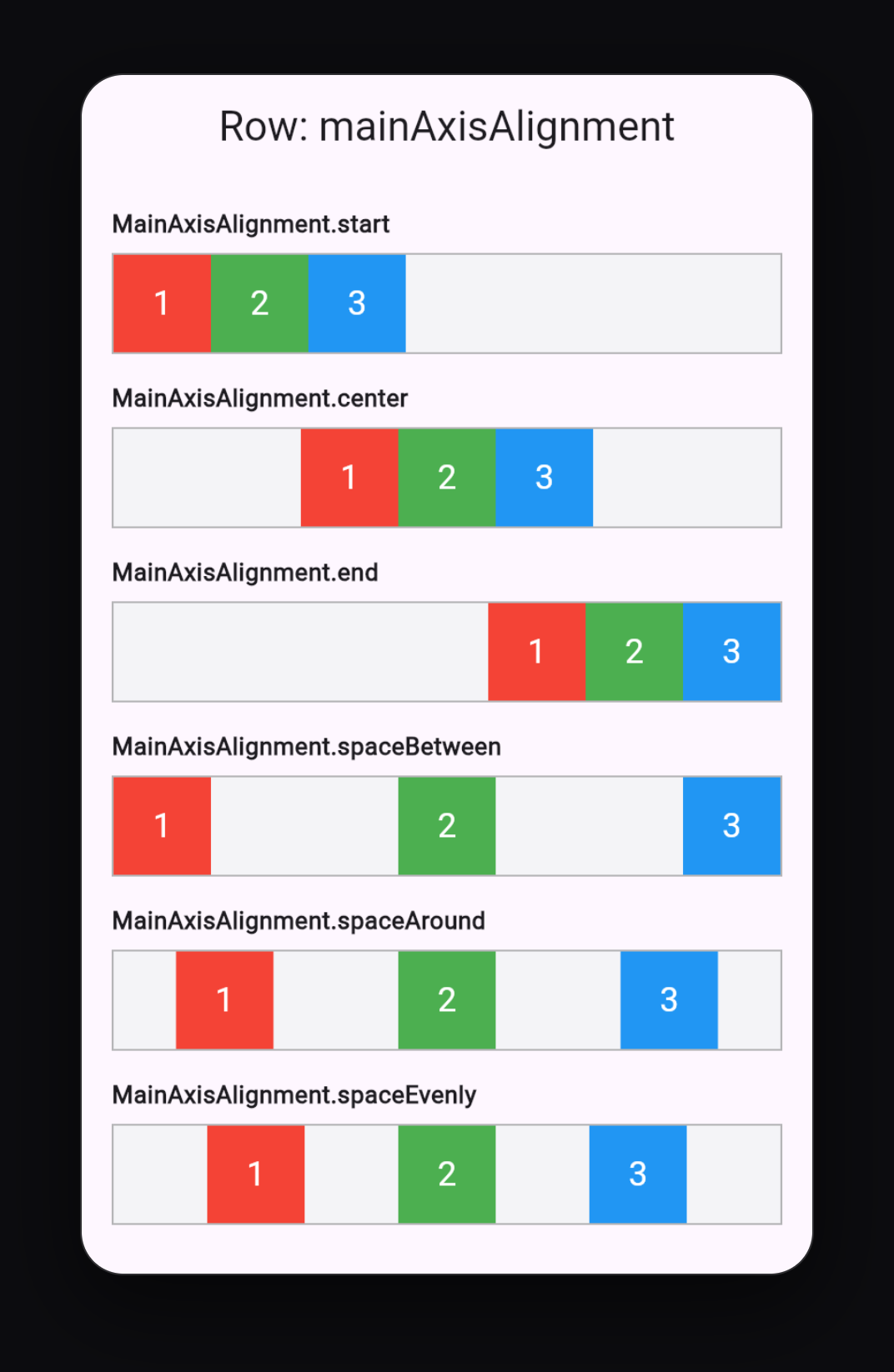
Here is what each MainAxisAlignment value does in a Row:
| Value | What it does |
|---|---|
start | packs children at the start (default) |
center | packs children in the middle |
end | packs children at the end |
spaceBetween | first and last touch the edges, equal space between |
spaceAround | equal space around each child (half-size at the edges) |
spaceEvenly | exactly equal space everywhere, including the edges |
The same values work for a Column, just vertically.
crossAxisAlignment
crossAxisAlignment lines children up along the other axis. In a Row, that means top, center or bottom:
Row(
  crossAxisAlignment: CrossAxisAlignment.start,
  children: [
    box(Colors.red, size: 50),
    box(Colors.green, size: 90),
    box(Colors.blue, size: 70),
  ],
)
| Value | In a Row | In a Column |
|---|---|---|
start | top | left |
center | middle (default) | middle (default) |
end | bottom | right |
stretch | fill full height | fill full width |
CrossAxisAlignment.stretch is very useful in a Column: it makes buttons and text fields fill the full width of the screen.
mainAxisSize
By default, a Column takes all the vertical space it can get, and a Row takes all the horizontal space. To make it only as big as its children, use:
Column(
  mainAxisSize: MainAxisSize.min,
  children: [ ... ],
)
This matters inside dialogs, cards and bottom sheets, where you want the content to be as small as possible.
Spacing between children
The modern way is the spacing property:
Column(
  spacing: 16,
  children: [
    Text('Name'),
    Text('Email'),
    Text('Phone'),
  ],
)
spacing adds the same gap between every child. It works on both Row and Column (added in Flutter 3.27).
You can also add a SizedBox between two children for one specific gap:
Row(
  children: [
    Icon(Icons.star),
    SizedBox(width: 8),
    Text('Favorite'),
  ],
)
Expanded, Flexible and Spacer
These widgets decide how much space each child gets.
Expanded
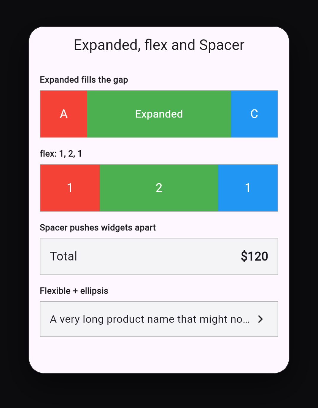
Expanded makes a child fill all the remaining space:
Row(
  children: [
    box(Colors.red, label: 'A'),
    Expanded(
      child: Container(height: 70, color: Colors.green),
    ),
    box(Colors.blue, label: 'C'),
  ],
)
The red and blue boxes keep their size, and the green box stretches to fill the gap.
flex: share space by ratio
When several children are Expanded, use flex to split the space:
Row(
  children: [
    Expanded(flex: 1, child: Container(height: 70, color: Colors.red)),
    Expanded(flex: 2, child: Container(height: 70, color: Colors.green)),
    Expanded(flex: 1, child: Container(height: 70, color: Colors.blue)),
  ],
)
The total flex is 4, so red gets 1/4, green 2/4 and blue 1/4 of the width.
Flexible
Flexible is like Expanded, but the child is allowed to be smaller than its share. Use it for text that should take space only when needed:
Row(
  children: [
    Flexible(
      child: Text(
        'A very long product name that might not fit',
        overflow: TextOverflow.ellipsis,
      ),
    ),
    Icon(Icons.chevron_right),
  ],
)
Spacer
Spacer is an empty Expanded. It pushes widgets apart:
Row(
  children: [
    Text('Total'),
    Spacer(),
    Text('\$120'),
  ],
)
"Total" stays on the left and the price moves to the far right. You will use this pattern in almost every list item and app bar.
Stack
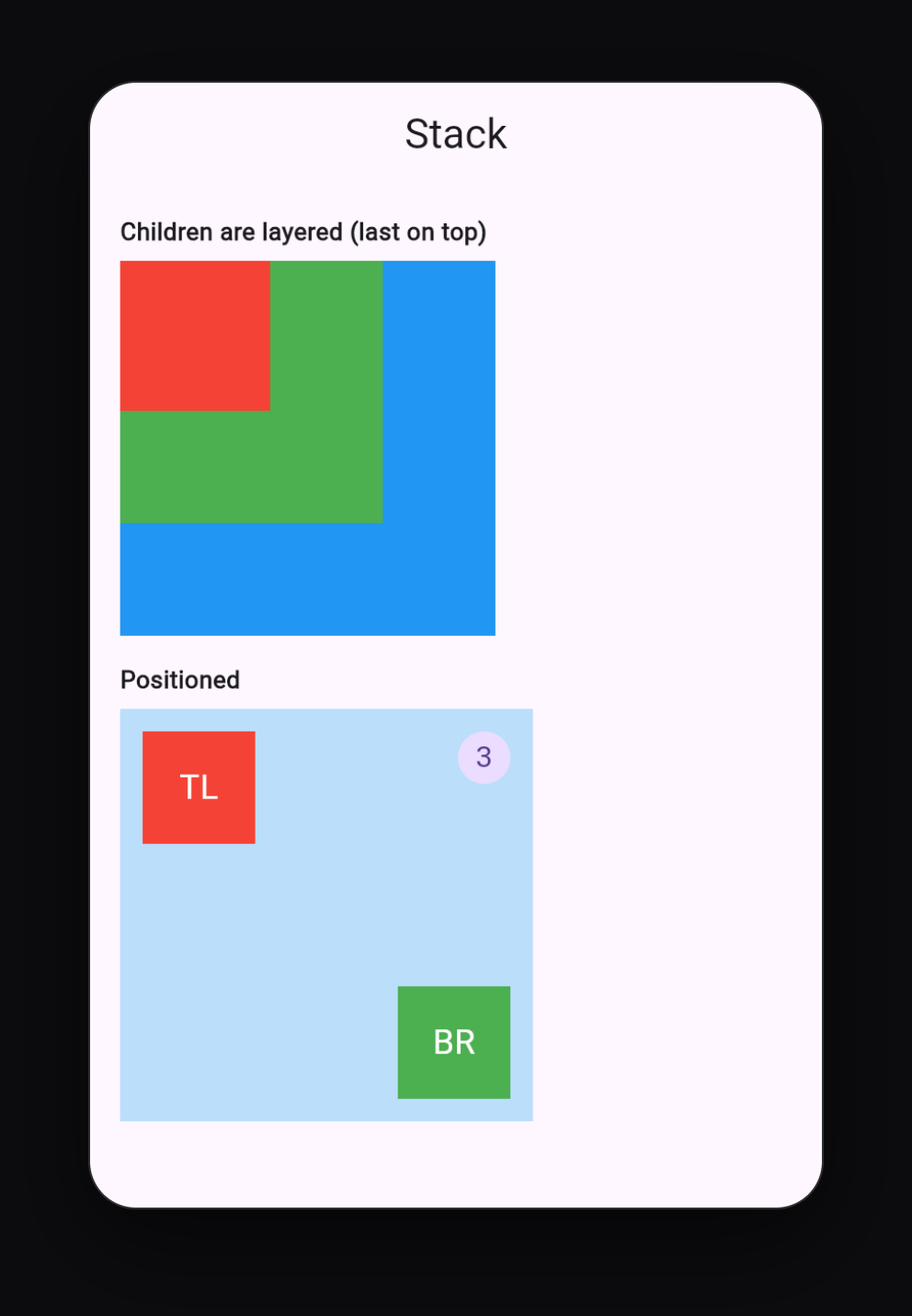
A Stack places children on top of each other. The first child is at the bottom, the last child is on top.
Stack(
  children: [
    box(Colors.blue, size: 200),
    box(Colors.green, size: 140),
    box(Colors.red, size: 80),
  ],
)
By default, every child starts at the top-left corner.
Positioned
Wrap a child in Positioned to place it exactly:
SizedBox(
  width: 220,
  height: 220,
  child: Stack(
    children: [
      Container(color: Colors.blue.shade100),
      Positioned(top: 12, left: 12, child: box(Colors.red, size: 60, label: 'TL')),
      Positioned(bottom: 12, right: 12, child: box(Colors.green, size: 60, label: 'BR')),
      Positioned(
        top: 12,
        right: 12,
        child: CircleAvatar(radius: 14, child: Text('3')),
      ),
    ],
  ),
)
top,bottom,leftandrightset the distance from each edge of the Stack.Positioned.fillmakes a child cover the whole Stack, which is handy for backgrounds and dark overlays on images.
Align inside a Stack
To center something or put it in a corner without exact numbers, use alignment on the Stack or wrap a child in Align:
Stack(
  alignment: Alignment.center,
  children: [ ... ],
)
Typical uses for Stack: a notification badge on an icon, text on top of an image, a gradient overlay, a floating button over a card, and a profile picture overlapping a cover photo.
Putting it all together: a profile card
Here is a real UI that uses all three widgets:
class ProfileCard extends StatelessWidget {
  const ProfileCard({super.key});

  @override
  Widget build(BuildContext context) {
    return Card(
      clipBehavior: Clip.antiAlias,
      child: Column(
        mainAxisSize: MainAxisSize.min,
        children: [
          // Stack: cover color with the avatar overlapping it
          SizedBox(
            height: 150,
            child: Stack(
              clipBehavior: Clip.none,
              alignment: Alignment.center,
              children: [
                Positioned.fill(
                  bottom: 50,
                  child: Container(color: Colors.indigo),
                ),
                const Positioned(
                  bottom: 0,
                  child: CircleAvatar(
                    radius: 50,
                    backgroundColor: Colors.white,
                    child: CircleAvatar(
                      radius: 46,
                      child: Icon(Icons.person, size: 48),
                    ),
                  ),
                ),
              ],
            ),
          ),
          const SizedBox(height: 12),
          const Text(
            'Yaqoob Developer',
            style: TextStyle(fontSize: 20, fontWeight: FontWeight.bold),
          ),
          const Text('Flutter Developer', style: TextStyle(color: Colors.grey)),
          const SizedBox(height: 16),
          // Row: three stats spread evenly
          const Row(
            mainAxisAlignment: MainAxisAlignment.spaceEvenly,
            children: [
              _Stat(value: '120', label: 'Posts'),
              _Stat(value: '8.5K', label: 'Followers'),
              _Stat(value: '310', label: 'Following'),
            ],
          ),
          const SizedBox(height: 16),
          // Row with Expanded: two buttons sharing the width
          Padding(
            padding: const EdgeInsets.fromLTRB(16, 0, 16, 16),
            child: Row(
              spacing: 12,
              children: [
                Expanded(
                  child: FilledButton(onPressed: () {}, child: const Text('Follow')),
                ),
                Expanded(
                  child: OutlinedButton(onPressed: () {}, child: const Text('Message')),
                ),
              ],
            ),
          ),
        ],
      ),
    );
  }
}

class _Stat extends StatelessWidget {
  const _Stat({required this.value, required this.label});

  final String value;
  final String label;

  @override
  Widget build(BuildContext context) {
    return Column(
      children: [
        Text(value, style: const TextStyle(fontSize: 18, fontWeight: FontWeight.bold)),
        Text(label, style: const TextStyle(color: Colors.grey)),
      ],
    );
  }
}
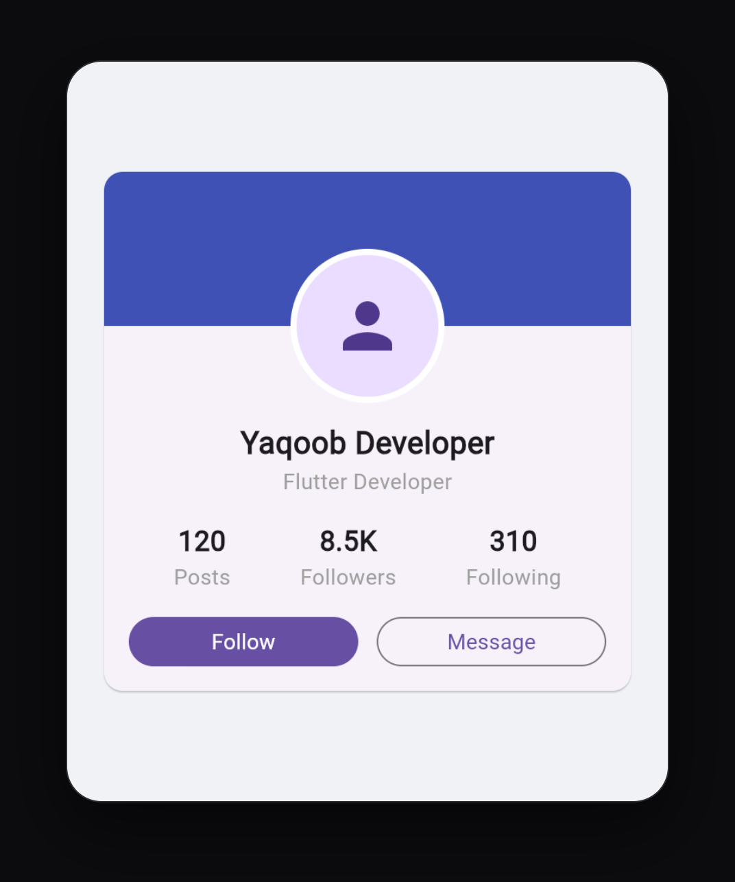
How the layout is built:
Card
└── Column                          → everything top to bottom
    ├── Stack                       → cover + avatar overlapping it
    ├── Text (name), Text (title)
    ├── Row (spaceEvenly)           → Posts | Followers | Following
    └── Row with two Expanded       → Follow | Message buttons
Learn to "see" designs this way. Before writing code, draw boxes on the design and ask: is this a Row, a Column or a Stack?
The "RenderFlex overflowed" error
This is the most common layout error in Flutter. You see yellow and black stripes and a message like:
A RenderFlex overflowed by 42 pixels on the right.
It means the children of a Row or Column are bigger than the available space. Fixes:
- Text in a Row is too long: wrap the
TextinExpandedorFlexibleand addoverflow: TextOverflow.ellipsis. - A Column is taller than the screen: wrap it in
SingleChildScrollView, or use aListViewinstead. - Fixed sizes are too big for small phones: replace fixed widths with
Expanded, or useWrapinstead ofRowso children move to the next line.
Other common errors
- "Vertical viewport was given unbounded height": you placed a
ListViewinside aColumn. Wrap theListViewinExpanded. Expandedhas no effect or throws an error:Expandedonly works as a direct child of a Row, Column or Flex. It does not work inside aContaineror aStack.Positionedthrows an error:Positionedonly works as a direct child of aStack.
Quick reference
| I want to... | Use |
|---|---|
| Stack widgets vertically | Column |
| Place widgets side by side | Row |
| Overlap widgets | Stack |
| Center children along the direction | mainAxisAlignment: MainAxisAlignment.center |
| Make children full width in a Column | crossAxisAlignment: CrossAxisAlignment.stretch |
| Same gap between all children | spacing: 12 |
| Fill remaining space | Expanded |
| Split space by ratio | Expanded(flex: 2, ...) |
| Push two widgets apart | Spacer() |
| Put a widget in a corner of a Stack | Positioned(top: 8, right: 8, ...) |
What to learn next
- Flutter ListView and GridView: Complete Beginner Guide for scrolling lists
- How to Create a Beautiful Login Screen in Flutter, which uses Stack, Column and Row together
- Browse my Flutter UI projects and try to spot the Rows, Columns and Stacks in each design
Keep reading
More articles
· 9 min read
Dart Basics for Flutter Beginners: Variables, Functions and Classes
Learn the Dart you need for Flutter: variables, final and const, null safety, lists and maps, if and loops, functions with named parameters, classes, and async/await, with runnable examples.
· 7 min read
Flutter Navigation: How to Move Between Screens
Learn Flutter navigation step by step: Navigator.push and pop, passing data to a screen, returning results, pushReplacement for login flows, named routes, and when to use go_router.
· 7 min read
Flutter ListView and GridView: Complete Beginner Guide
Build scrolling lists and grids in Flutter: ListView, ListView.builder, ListView.separated, horizontal lists, GridView.builder, childAspectRatio, and a complete responsive product grid.