How to Create a Beautiful Login Screen in Flutter
Design a modern Flutter login screen step by step: gradient header, rounded card, styled text fields, show/hide password, validation, loading button and social login buttons, with full code.
By Yaqoob Developer · · 11 min read
- #Flutter
- #Flutter UI
- #Login Screen
- #Design
- #Beginners
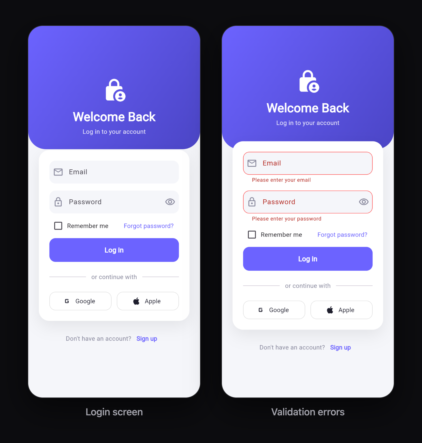
A login screen is the first thing most users see in your app, so it should look clean and modern. In this tutorial you will build a beautiful login screen in Flutter step by step: a gradient background, a rounded card, styled input fields, a show/hide password button, form validation, a loading button and social login buttons.
You do not need any extra packages. Everything uses Flutter's built-in widgets, and the full code is at the end so you can copy it into your project.
In this post you will learn:
- The design rules that make a login screen look professional
- How to create a gradient background
- How to style
TextFormFieldwith rounded borders and icons - How to add a show/hide password toggle
- How to validate email and password
- How to build a primary button with a loading state
- How to add "Continue with Google / Apple" style buttons
- How to make the screen work on small phones, tablets and web
Before you start
You need a Flutter project that runs. If you are brand new, start with Your First Flutter App: Step-by-Step Tutorial for Beginners, then come back here.
Create a new file: lib/login_screen.dart. We will build the screen in this file, piece by piece.
Design rules for a good login screen
Before writing code, here are the rules that separate a beginner screen from a polished one:
- One clear goal. The screen should make one action obvious: logging in. Make the "Log in" button the strongest element on the screen.
- Consistent spacing. Use the same spacing values everywhere, like 8, 16, 24 and 32. Random spacing looks messy.
- Rounded corners everywhere. Use one radius (for example 14) for fields, buttons and cards.
- Few colors. One brand color, one background, and greys for text. Too many colors look cheap.
- Readable on every screen. Limit the width on tablets and web, and make the content scrollable so the keyboard never hides the button.
We will follow all five.
Step 1: Set up the colors
Put your colors in one place so the whole screen stays consistent. At the top of lib/login_screen.dart:
import 'package:flutter/material.dart';

class AppColors {
  static const primary = Color(0xFF6C63FF);
  static const primaryDark = Color(0xFF4B45C6);
  static const background = Color(0xFFF5F6FA);
  static const textDark = Color(0xFF1E1E2D);
  static const textLight = Color(0xFF8A8A9E);
}
Want a different look? Change only primary and primaryDark and the whole screen follows.
Step 2: The gradient header
A gradient instantly makes a screen feel more designed. We will put a gradient at the top of the screen and the login card on top of it.
Container(
  height: 280,
  decoration: const BoxDecoration(
    gradient: LinearGradient(
      colors: [AppColors.primary, AppColors.primaryDark],
      begin: Alignment.topLeft,
      end: Alignment.bottomRight,
    ),
    borderRadius: BorderRadius.only(
      bottomLeft: Radius.circular(40),
      bottomRight: Radius.circular(40),
    ),
  ),
)
LinearGradientblends from the first color to the second.beginandendset the direction. Top-left to bottom-right gives a natural diagonal.- Rounding only the bottom corners creates a soft "wave" feel.
Step 3: A reusable input decoration
Instead of styling every field separately, we create one function that returns the style. This keeps both fields identical.
InputDecoration _inputDecoration({
  required String label,
  required IconData icon,
  Widget? suffix,
}) {
  final radius = BorderRadius.circular(14);
  return InputDecoration(
    labelText: label,
    prefixIcon: Icon(icon, color: AppColors.textLight),
    suffixIcon: suffix,
    filled: true,
    fillColor: AppColors.background,
    contentPadding: const EdgeInsets.symmetric(vertical: 18, horizontal: 16),
    border: OutlineInputBorder(borderRadius: radius, borderSide: BorderSide.none),
    enabledBorder: OutlineInputBorder(
      borderRadius: radius,
      borderSide: BorderSide.none,
    ),
    focusedBorder: OutlineInputBorder(
      borderRadius: radius,
      borderSide: const BorderSide(color: AppColors.primary, width: 1.5),
    ),
    errorBorder: OutlineInputBorder(
      borderRadius: radius,
      borderSide: const BorderSide(color: Colors.redAccent),
    ),
    focusedErrorBorder: OutlineInputBorder(
      borderRadius: radius,
      borderSide: const BorderSide(color: Colors.redAccent, width: 1.5),
    ),
  );
}
Why so many borders? Flutter lets you style each state separately:
- enabledBorder: the normal state. We hide the border and use a soft fill color instead, which looks more modern.
- focusedBorder: when the user taps the field, a thin brand-colored border appears, so they always know where they are typing.
- errorBorder / focusedErrorBorder: red when validation fails.
Step 4: Email field with validation
TextFormField(
  controller: _emailController,
  keyboardType: TextInputType.emailAddress,
  autofillHints: const [AutofillHints.email],
  textInputAction: TextInputAction.next,
  decoration: _inputDecoration(label: 'Email', icon: Icons.email_outlined),
  validator: (value) {
    final email = value?.trim() ?? '';
    if (email.isEmpty) return 'Please enter your email';
    final emailRegex = RegExp(r'^[^@\s]+@[^@\s]+\.[^@\s]+$');
    if (!emailRegex.hasMatch(email)) return 'Please enter a valid email';
    return null;
  },
)
Small details that make a big difference:
keyboardType: TextInputType.emailAddressshows a keyboard with@and.keys.autofillHintslets the phone's password manager fill in the email.textInputAction: TextInputAction.nextchanges the keyboard's Enter key to "Next", which jumps to the password field.- The
validatorreturns an error message, ornullwhen the value is fine.
Step 5: Password field with show/hide toggle
TextFormField(
  controller: _passwordController,
  obscureText: _obscurePassword,
  autofillHints: const [AutofillHints.password],
  textInputAction: TextInputAction.done,
  onFieldSubmitted: (_) => _submit(),
  decoration: _inputDecoration(
    label: 'Password',
    icon: Icons.lock_outline,
    suffix: IconButton(
      icon: Icon(
        _obscurePassword
            ? Icons.visibility_outlined
            : Icons.visibility_off_outlined,
        color: AppColors.textLight,
      ),
      onPressed: () => setState(() => _obscurePassword = !_obscurePassword),
    ),
  ),
  validator: (value) {
    if (value == null || value.isEmpty) return 'Please enter your password';
    if (value.length < 6) return 'Password must be at least 6 characters';
    return null;
  },
)
obscureTexthides the characters. We store it in_obscurePasswordand flip it when the eye icon is tapped.onFieldSubmittedsubmits the form when the user presses "Done" on the keyboard, so they do not have to reach for the button.
Step 6: The login button with a loading state
A good button shows that something is happening. Otherwise users tap it again and again.
SizedBox(
  height: 54,
  child: FilledButton(
    onPressed: _loading ? null : _submit,
    style: FilledButton.styleFrom(
      backgroundColor: AppColors.primary,
      shape: RoundedRectangleBorder(borderRadius: BorderRadius.circular(14)),
      textStyle: const TextStyle(fontSize: 16, fontWeight: FontWeight.w600),
    ),
    child: _loading
        ? const SizedBox(
            height: 22,
            width: 22,
            child: CircularProgressIndicator(strokeWidth: 2.5, color: Colors.white),
          )
        : const Text('Log in'),
  ),
)
Setting onPressed to null while loading disables the button, so the form cannot be sent twice.
And the _submit function:
Future<void> _submit() async {
  FocusScope.of(context).unfocus(); // hide the keyboard
  if (!_formKey.currentState!.validate()) return;

  setState(() => _loading = true);

  // Replace this delay with your real login call (Firebase, API, ...).
  await Future.delayed(const Duration(seconds: 2));

  if (!mounted) return;
  setState(() => _loading = false);
  ScaffoldMessenger.of(context).showSnackBar(
    const SnackBar(content: Text('Logged in successfully!')),
  );
}
Step 7: Social login buttons
Social buttons are outlined, so they never compete with the main button.
Widget _socialButton({required IconData icon, required String label}) {
  return Expanded(
    child: OutlinedButton.icon(
      onPressed: () {},
      icon: Icon(icon, size: 22, color: AppColors.textDark),
      label: Text(label, style: const TextStyle(color: AppColors.textDark)),
      style: OutlinedButton.styleFrom(
        minimumSize: const Size.fromHeight(50),
        side: BorderSide(color: Colors.grey.shade300),
        shape: RoundedRectangleBorder(borderRadius: BorderRadius.circular(14)),
      ),
    ),
  );
}
We use simple Material icons here so the tutorial needs no packages. In a real app, use the official Google and Apple logos (for example with an SVG asset) and follow each provider's branding guidelines.
Step 8: Make it responsive
Two widgets make the screen work everywhere:
SingleChildScrollViewlets the content scroll, so the keyboard never covers the fields on small phones.ConstrainedBox(constraints: BoxConstraints(maxWidth: 420))stops the card from stretching across a whole tablet or desktop browser window.
The complete code
Here is the full lib/login_screen.dart:
import 'package:flutter/material.dart';
class AppColors {
static const primary = Color(0xFF6C63FF);
static const primaryDark = Color(0xFF4B45C6);
static const background = Color(0xFFF5F6FA);
static const textDark = Color(0xFF1E1E2D);
static const textLight = Color(0xFF8A8A9E);
}
class LoginScreen extends StatefulWidget {
const LoginScreen({super.key});
@override
State<LoginScreen> createState() => _LoginScreenState();
}
class _LoginScreenState extends State<LoginScreen> {
final _formKey = GlobalKey<FormState>();
final _emailController = TextEditingController();
final _passwordController = TextEditingController();
bool _obscurePassword = true;
bool _rememberMe = false;
bool _loading = false;
@override
void dispose() {
_emailController.dispose();
_passwordController.dispose();
super.dispose();
}
Future<void> _submit() async {
FocusScope.of(context).unfocus();
if (!_formKey.currentState!.validate()) return;
setState(() => _loading = true);
// Replace this delay with your real login call (Firebase, API, ...).
await Future.delayed(const Duration(seconds: 2));
if (!mounted) return;
setState(() => _loading = false);
ScaffoldMessenger.of(context).showSnackBar(
const SnackBar(content: Text('Logged in successfully!')),
);
}
InputDecoration _inputDecoration({
required String label,
required IconData icon,
Widget? suffix,
}) {
final radius = BorderRadius.circular(14);
return InputDecoration(
labelText: label,
prefixIcon: Icon(icon, color: AppColors.textLight),
suffixIcon: suffix,
filled: true,
fillColor: AppColors.background,
contentPadding: const EdgeInsets.symmetric(vertical: 18, horizontal: 16),
border: OutlineInputBorder(borderRadius: radius, borderSide: BorderSide.none),
enabledBorder: OutlineInputBorder(
borderRadius: radius,
borderSide: BorderSide.none,
),
focusedBorder: OutlineInputBorder(
borderRadius: radius,
borderSide: const BorderSide(color: AppColors.primary, width: 1.5),
),
errorBorder: OutlineInputBorder(
borderRadius: radius,
borderSide: const BorderSide(color: Colors.redAccent),
),
focusedErrorBorder: OutlineInputBorder(
borderRadius: radius,
borderSide: const BorderSide(color: Colors.redAccent, width: 1.5),
),
);
}
Widget _socialButton({required IconData icon, required String label}) {
return Expanded(
child: OutlinedButton.icon(
onPressed: () {},
icon: Icon(icon, size: 22, color: AppColors.textDark),
label: Text(label, style: const TextStyle(color: AppColors.textDark)),
style: OutlinedButton.styleFrom(
minimumSize: const Size.fromHeight(50),
side: BorderSide(color: Colors.grey.shade300),
shape: RoundedRectangleBorder(borderRadius: BorderRadius.circular(14)),
),
),
);
}
@override
Widget build(BuildContext context) {
return Scaffold(
backgroundColor: AppColors.background,
body: Stack(
children: [
// Gradient header behind the card.
Container(
height: 280,
decoration: const BoxDecoration(
gradient: LinearGradient(
colors: [AppColors.primary, AppColors.primaryDark],
begin: Alignment.topLeft,
end: Alignment.bottomRight,
),
borderRadius: BorderRadius.only(
bottomLeft: Radius.circular(40),
bottomRight: Radius.circular(40),
),
),
),
SafeArea(
child: Center(
child: SingleChildScrollView(
padding: const EdgeInsets.all(24),
child: ConstrainedBox(
constraints: const BoxConstraints(maxWidth: 420),
child: Column(
children: [
const Icon(Icons.lock_person_rounded, size: 56, color: Colors.white),
const SizedBox(height: 12),
const Text(
'Welcome Back',
style: TextStyle(
color: Colors.white,
fontSize: 28,
fontWeight: FontWeight.bold,
),
),
const SizedBox(height: 4),
Text(
'Log in to your account',
style: TextStyle(color: Colors.white.withValues(alpha: 0.85)),
),
const SizedBox(height: 32),
// The white card.
Container(
padding: const EdgeInsets.all(24),
decoration: BoxDecoration(
color: Colors.white,
borderRadius: BorderRadius.circular(24),
boxShadow: [
BoxShadow(
color: Colors.black.withValues(alpha: 0.08),
blurRadius: 30,
offset: const Offset(0, 12),
),
],
),
child: Form(
key: _formKey,
child: Column(
crossAxisAlignment: CrossAxisAlignment.stretch,
children: [
TextFormField(
controller: _emailController,
keyboardType: TextInputType.emailAddress,
autofillHints: const [AutofillHints.email],
textInputAction: TextInputAction.next,
decoration: _inputDecoration(
label: 'Email',
icon: Icons.email_outlined,
),
validator: (value) {
final email = value?.trim() ?? '';
if (email.isEmpty) return 'Please enter your email';
final emailRegex = RegExp(r'^[^@\s]+@[^@\s]+\.[^@\s]+$');
if (!emailRegex.hasMatch(email)) {
return 'Please enter a valid email';
}
return null;
},
),
const SizedBox(height: 16),
TextFormField(
controller: _passwordController,
obscureText: _obscurePassword,
autofillHints: const [AutofillHints.password],
textInputAction: TextInputAction.done,
onFieldSubmitted: (_) => _submit(),
decoration: _inputDecoration(
label: 'Password',
icon: Icons.lock_outline,
suffix: IconButton(
icon: Icon(
_obscurePassword
? Icons.visibility_outlined
: Icons.visibility_off_outlined,
color: AppColors.textLight,
),
onPressed: () => setState(
() => _obscurePassword = !_obscurePassword,
),
),
),
validator: (value) {
if (value == null || value.isEmpty) {
return 'Please enter your password';
}
if (value.length < 6) {
return 'Password must be at least 6 characters';
}
return null;
},
),
const SizedBox(height: 8),
Row(
children: [
Checkbox(
value: _rememberMe,
activeColor: AppColors.primary,
onChanged: (v) => setState(() => _rememberMe = v ?? false),
),
const Text('Remember me'),
const Spacer(),
TextButton(
onPressed: () {},
child: const Text(
'Forgot password?',
style: TextStyle(color: AppColors.primary),
),
),
],
),
const SizedBox(height: 8),
SizedBox(
height: 54,
child: FilledButton(
onPressed: _loading ? null : _submit,
style: FilledButton.styleFrom(
backgroundColor: AppColors.primary,
shape: RoundedRectangleBorder(
borderRadius: BorderRadius.circular(14),
),
textStyle: const TextStyle(
fontSize: 16,
fontWeight: FontWeight.w600,
),
),
child: _loading
? const SizedBox(
height: 22,
width: 22,
child: CircularProgressIndicator(
strokeWidth: 2.5,
color: Colors.white,
),
)
: const Text('Log in'),
),
),
const SizedBox(height: 24),
const Row(
children: [
Expanded(child: Divider()),
Padding(
padding: EdgeInsets.symmetric(horizontal: 12),
child: Text(
'or continue with',
style: TextStyle(color: AppColors.textLight),
),
),
Expanded(child: Divider()),
],
),
const SizedBox(height: 24),
Row(
children: [
_socialButton(icon: Icons.g_mobiledata, label: 'Google'),
const SizedBox(width: 12),
_socialButton(icon: Icons.apple, label: 'Apple'),
],
),
],
),
),
),
const SizedBox(height: 24),
Row(
mainAxisAlignment: MainAxisAlignment.center,
children: [
const Text(
"Don't have an account?",
style: TextStyle(color: AppColors.textLight),
),
TextButton(
onPressed: () {},
child: const Text(
'Sign up',
style: TextStyle(
color: AppColors.primary,
fontWeight: FontWeight.w600,
),
),
),
],
),
],
),
),
),
),
),
],
),
);
}
}
Now show it from lib/main.dart:
import 'package:flutter/material.dart';

import 'login_screen.dart';

void main() {
  runApp(const MyApp());
}

class MyApp extends StatelessWidget {
  const MyApp({super.key});

  @override
  Widget build(BuildContext context) {
    return MaterialApp(
      debugShowCheckedModeBanner: false,
      theme: ThemeData(useMaterial3: true),
      home: const LoginScreen(),
    );
  }
}
Run the app with flutter run. Tap Log in with empty fields to see the validation messages, then enter a valid email and password to see the loading spinner.
How the layout is built
Scaffold
└── Stack                       → layers widgets on top of each other
    ├── Container (gradient)    → bottom layer, top 280px
    └── SafeArea
        └── Center
            └── SingleChildScrollView   → scrolls when the keyboard opens
                └── ConstrainedBox      → max 420px wide
                    └── Column
                        ├── Icon + titles (white, on the gradient)
                        ├── White card with shadow
                        │   └── Form: fields, remember me, button, social buttons
                        └── "Don't have an account? Sign up"
The trick is the Stack: the gradient sits behind everything, and the white card naturally overlaps it, which gives the screen depth without any complex code.
Ideas to make it your own
- Custom font: add the
google_fontspackage and settextTheme: GoogleFonts.poppinsTextTheme()in yourThemeData. - Illustration: replace the lock icon with an image or a Lottie animation in the header.
- Dark mode: move the colors into a
ThemeDatawith a darkColorSchemeinstead of fixedAppColors. - Entry animation: wrap the card in
TweenAnimationBuilderto fade and slide it in when the screen opens.
Common mistakes
The keyboard covers the fields
The content is not scrollable. Wrap it in SingleChildScrollView, as in the full code, and keep Scaffold's default resizeToAvoidBottomInset: true.
"A RenderFlex overflowed" on small phones
A Row has more content than width. In our social buttons, each button is wrapped in Expanded, so they share the width instead of overflowing.
Validation messages do not appear
The fields must be inside a Form with a GlobalKey<FormState>, and you must call _formKey.currentState!.validate() in the submit function.
Connect it to a real backend
This screen is UI only. To make the login actually work, connect it to Firebase:
Replace the Future.delayed line in _submit with your sign-in call.
Want more designs? Browse my Flutter UI projects: there are many login and sign-in screens (travel, coffee, crypto wallet, car apps and more), each with full source code and a build video.
Keep reading
More articles
· 9 min read
Dart Basics for Flutter Beginners: Variables, Functions and Classes
Learn the Dart you need for Flutter: variables, final and const, null safety, lists and maps, if and loops, functions with named parameters, classes, and async/await, with runnable examples.
· 9 min read
Flutter Row, Column and Stack Explained with Examples
Understand Flutter's core layout widgets: main and cross axis, mainAxisAlignment, crossAxisAlignment, Expanded, Flexible, Spacer, Stack and Positioned, plus a complete profile card example.
· 7 min read
Flutter Navigation: How to Move Between Screens
Learn Flutter navigation step by step: Navigator.push and pop, passing data to a screen, returning results, pushReplacement for login flows, named routes, and when to use go_router.